
An investigation into five iterations of Kickstarter’s website (V1, V2, V3, V4/V4.1/V4.2, V5) reveals:
- How to apply the “show, don’t tell” writing technique to copywriting
- How to ensure your audience will trust you with their money
- Why you should position your site as a place where customer success stories begin
Soon after its launch in 2009, Kickstarter’s name became synonymous with a trend that captivated media outlets and audiences alike. The range of projects the site helped crowdfund, from smartwatches to books to albums, were great fodder for digital news outlets and social media sharing. Ten years later, Kickstarter shows no signs of letting up. Analyzing its copywriting over the years, we’ve discovered how their site defined itself as a home for creators, and how other companies can use these insights to turn their own services into a destination.
Show, Don’t Tell, What You Sell
From the day it launched on the website of Andy Baio, its early advisor and first CTO, Kickstarter understood this lesson, which we’ve also seen from Slack. Competitors like Indiegogo used up precious homepage real estate describing their business, but Kickstarter devoted that space to highlighting user projects and showing people what it could do.
In the first iteration of its website (V1), Kickstarter opted to prove itself to would-be funders with a Learn More page. The page’s FAQ started by repeating their homepage header: “A new way to fund ideas and endeavors.”
The Learn More page told their audience who they were and why they could be trusted. It’s natural for new visitors to want this information, and leaving it out or making it hard to find signals a lack of credibility. It's better to define yourself early, and be as transparent and trustworthy as possible.
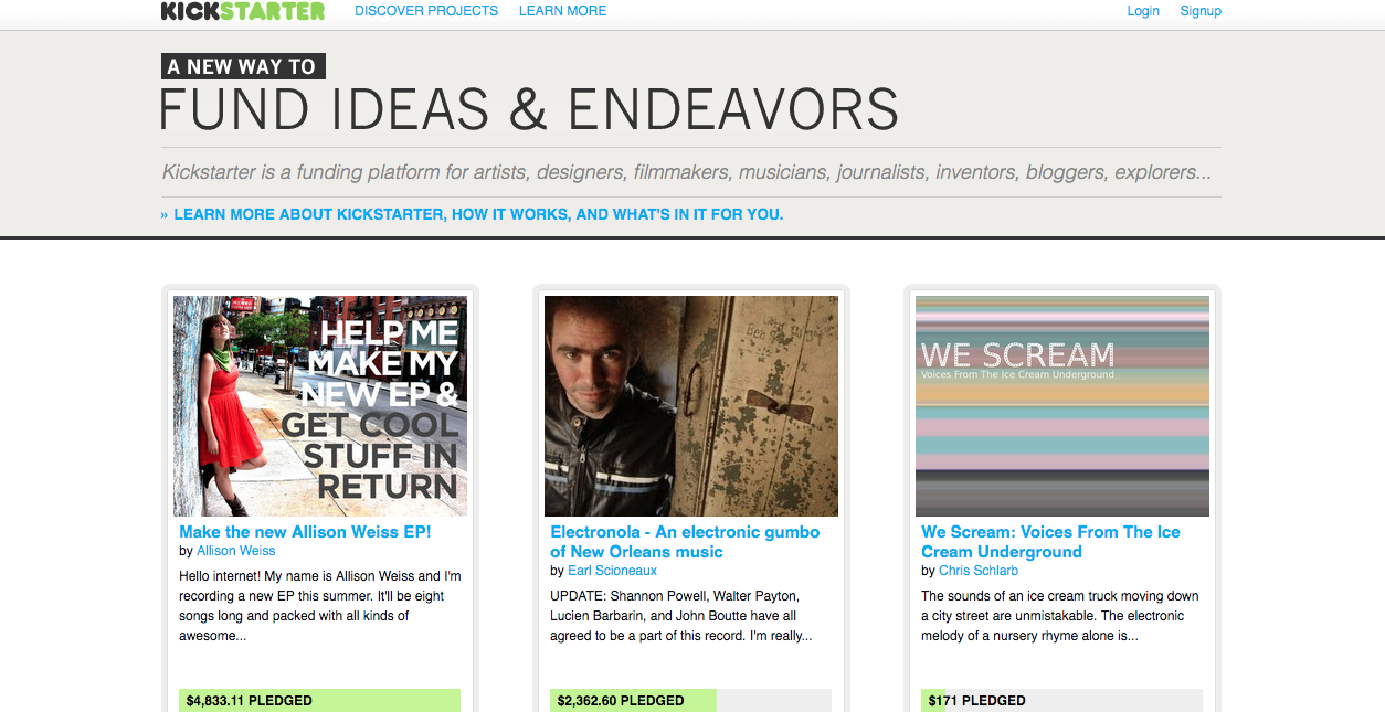
In an effort to appeal to a wide audience, V1’s homepage subhead said, “Kickstarter is a funding platform for artists, designers, filmmakers, musicians, journalists, inventors, bloggers, explorers…”
While that exhaustive list might not have been the most concise description, it did call out the versatility of a creative platform, as well as the symbiotic relationship between interesting projects and the media outlets that covered them.
“Kickstarter is a venue, like eBay or Etsy,” the Learn More page said in V1. From the very beginning, the emphasis was on how Kickstarter could be a place to facilitate user creativity and be a part of each project’s story.

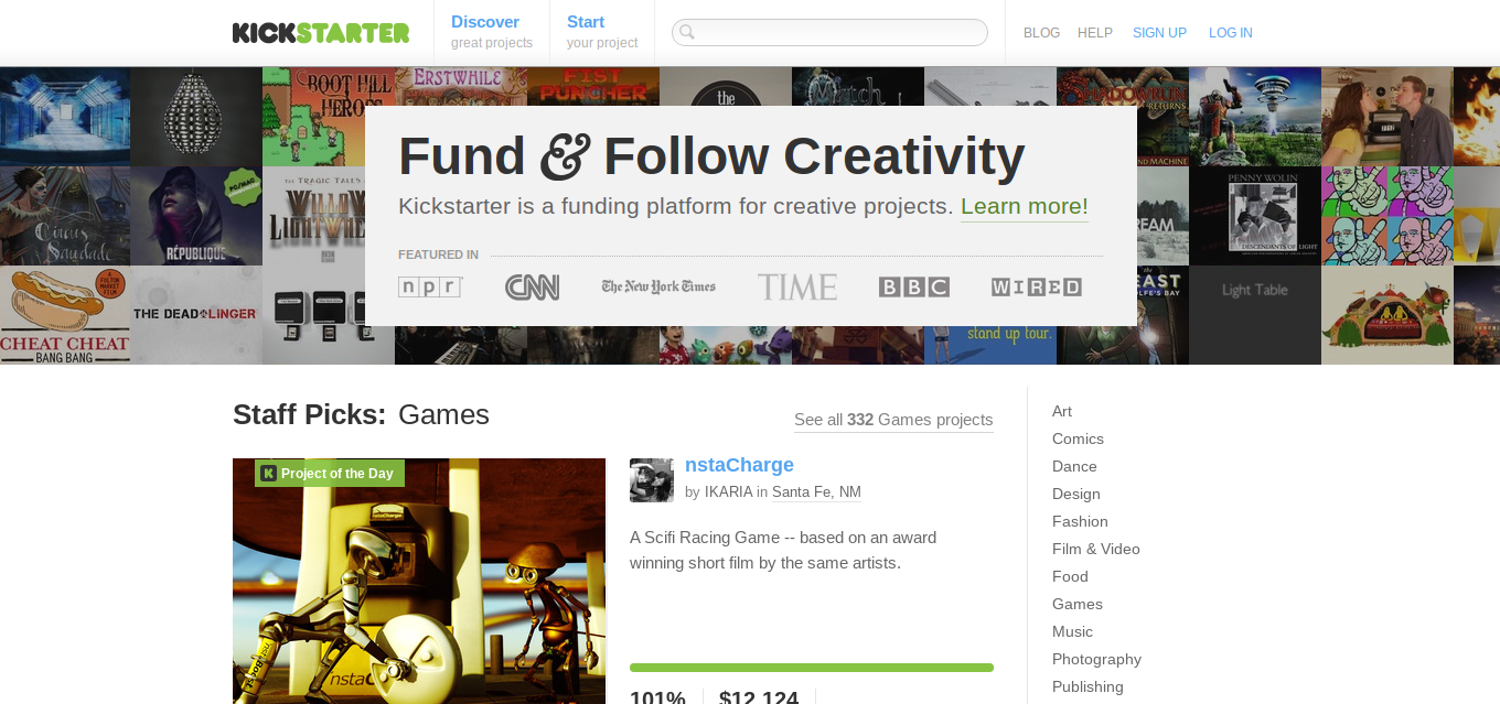
In V2, a year after its launch, creativity became the focus of the site’s header: “A New Way to Fund & Follow Creativity.” There was also calls-to-action to “Discover more projects, or learn more about starting a project.” Kickstarter had found its unifying thread, just as WeWork did with the “entrepreneurial spirit” of its customers.
Kickstarter simplified the previous version’s long list of users into one: creatives. “Ideas” and “endeavors” were out; it was about honing in on “projects” and “creativity” now. Instead of listing the many people who could make projects, they focused on the creativity they shared.
In the same 2010 version of the site, the Learn More page became FAQ and Guidelines. Project categories, such as those for film, comics and tech, were added to the homepage to ease navigation. Projects captions featured an editorialized description of each project — each one written to bolster the creator’s credibility, which adds to Kickstarter’s credibility.
Build Trust at Another Page, Not the Homepage
The year 2012 saw V3 of Kickstarter’s site. Bringing back “funding platform” from V1, the site referred to itself as “a funding platform for creative projects” and urged readers to “Fund & Follow Creativity.”
The Learn More page made a comeback in this version, albeit in a different form. There were CTAs at the top and bottom of the page, and the top one brought up a slideshow elevator pitch.
“Every project is independently crafted, put to all-or-nothing funding, and supported by friends, fans, and the public in return for rewards. Have 60 seconds? We'll explain it all.” The quick pop-up was more inviting than an entirely new page of descriptions that could be easily ignored, but it still didn’t take up any homepage space.
Also in the Learn More section, Kickstarter honed in on a phrase that appealed to the audience’s emotions, claiming each “project is the independent creation of someone like you.”

In 2013’s V4, they added two calls-to-action for their Learn More page: “Curious about how it works?” and “What is Kickstarter?” In true internet fashion, the next year (V4.1), they turned that page into a listicle: “Seven things to know about Kickstarter.”
In V4.2, Kickstarter’s Learn More page called it “a vibrant community of people working together to bring new things to life.” By then, in 2014, it also had numbers to prove it: “Friends, fans, and inspired strangers have pledged $1 billion to projects on Kickstarter, funding everything from homemade postcards to Oscar-winning documentaries.” It also shared data on how many millions of people have backed Kickstarter projects.
Through all these updates, Kickstarter continued to improve its relationship with its audience, but talked about itself off the homepage (other than CTAs). It’s a great balance to put projects first and lead readers elsewhere if they’re looking to know more about what Kickstarter actually is.
Become a Place
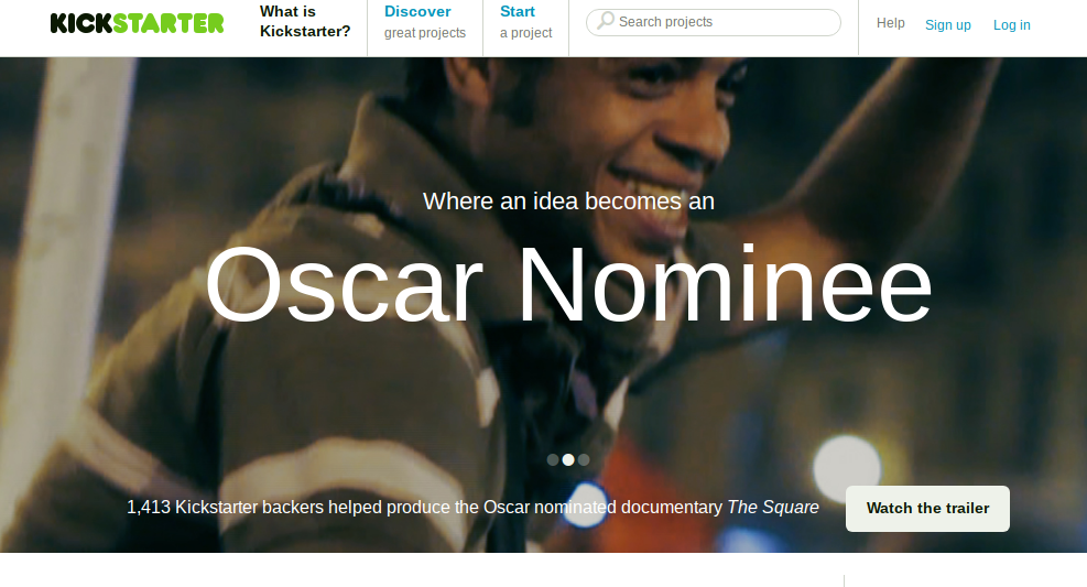
In V4.1, one of the slider banner’s sections solidified Kickstarter as a place: “Where an idea becomes an Oscar Nominee.” The other two sections were about Kickstarter projects at Sundance and “The Year in Kickstarter,” a recap of the previous year’s projects. All three sections are about what people have made at Kickstarter.
As with Slack (“Where work happens”), the defining feature of Kickstarter is not the “what.” Slack is software and Kickstarter is a website, but they both focus on how their customers use them as a part of their success. They are destinations, rather than products or services.
Even back in V1, Kickstarter described itself as “a venue.” As they showcased projects and established trust with creators and backers, they became the “where” of an endless number of projects. Even though the boom of Kickstarter coverage has died down, every funded project will include a line at the beginning of its origin story that goes a little something like, “It all started with a successful Kickstarter…”
Establishing yourself as a “where” enables you to describe a benefit that everyone understands, but you are still free to build something nobody has seen before. It’s less confusing; it’s concise. And in the long run, it can remain true if you are mission-driven enough.
Kickstarter started by describing itself as a “funding platform,” but moved away from that. The label came in handy before audiences knew what Kickstarter was, but now that they have a reputation, it would be limiting to them. They aren’t a funding platform, they are the place where projects begin.

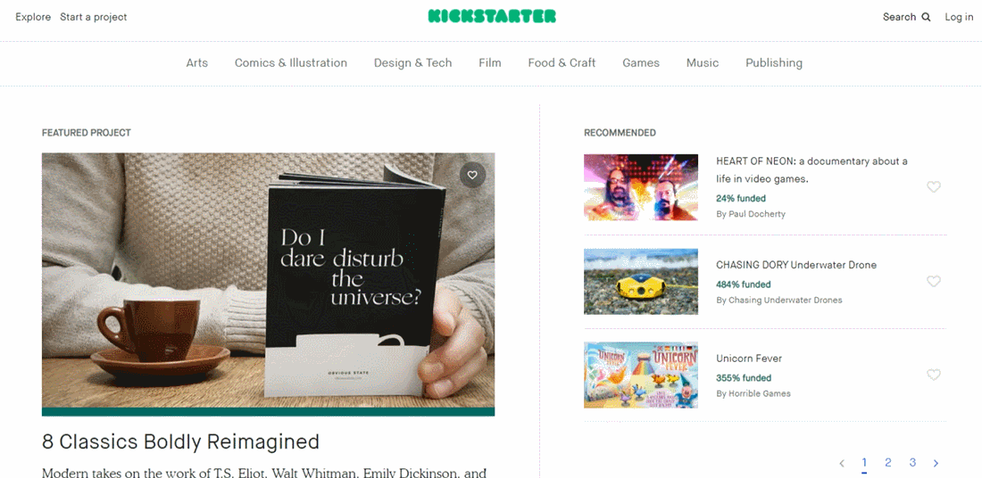
The current Kickstarter site, V5, embodies all of the points we discovered in past versions. It’s homepage is still fully dedicated to projects. There’s no upfront explanations, no Learn More page, and you have to scroll all the way to the bottom to find the About Us link in the menu.
With extensive homepage navigation, a podcast about creators and a variety of project newsletters, everything on Kickstarter’s site fulfills two purposes: making it a “where” and encouraging creativity. The “where” focus developed as the business moved away from “funding platform” and into its own brand-new domain as a destination for creativity. And creativity was an early unifier for the variety of projects, but continuing to encourage it helps Kickstarter as much as it helps would-be creators.
When more people run, Nike sells more running shoes. And when more people create, more people choose Kickstarter to help fund their projects.
Kickstarter announced it had reached 15 million backers in July 2018. The total backer count was more than 16 million as of October 2019. If you liked this piece, check out our previous pieces on WeWork and Slack.
